Introduction
In this lab, you will work with data from life tables.
You will learn what life tables are used for, how to visualize the data from life tables, and how to calculate values in the table.
Life Expectancy
Life tables are used to calculate life expectancy for a population. Life expectancy at birth is one statistic you commonly hear reported in the news. The CDC releases a yearly report for the US population and for two years in a row life expectancy in the US has decreased Read the report. The at least some of the decrease in life expectancy has been attributed to preventable causes like drug overdose. The good news is that if the decrease is due to preventable cause we can do something about it.
Most people don’t really understand what life expectancy a birth is. Life expectancy at birth is defined as how long, on average, a newborn can expect to live, if current death rates do not change. The second part is a pretty strong assumption. It is unlikely that the same mortality patterns for ages 1-100+ stay the same through out the whole life of a new born. Mortality patterns are not static so the actual life expectancy maybe more or less. The “true” life expectancy of a new born can only be calculated once everyone born that year have died, but that measure is not really used for public health since it is not helpful. The best way to interpret life expectancy at birth is that if nothing changes (in med)
Life expectancy is used as a marker of a populations total health, and is often used to compare the health in different nations. Increases in life expectancy are generally related increases in sanitation (think clean drinking water), improvements in standard of living (better housing, access to food), access to medical care, and breakthroughs in medical science or quitting harmful behaviors (like smoking in the US). Check out Our World in Data and you can see life expediencies for countries across the globe from 1543 to 2015.
Exercise 1
Instructions: Play around with the interactive plot. You can see the change in life expectancy over a range years for everyone and you can also stratified by sex. Use the plot below to answer quiz questions 1-3 (set the year range to 1900 and 2015 to answer the questions ).
Quiz: Questions 1-3
Survival Curves
Another common representation of life table data is the survival curve or survivor-ship which is what the CDC calls it. These curves show the proportion of individuals who survived to each age group. The graph below represents three general survival curves. The type one curve is typical of humans who have only a few offspring and invest a lot of effort keeping them alive. The type 2 curve is a diagonal which means that mortality rate is more or less constant regardless of the age. The third type is concave this indicates that the greatest risk of mortality is early in life. Sea turtles, amphibians, and other animals who have huge number of offspring often have survival curves with this shape.
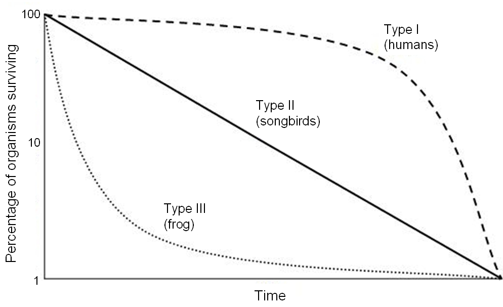
Image By Rayhusthwaite at English Wikipedia, CC BY 3.0, https://commons.wikimedia.org/w/index.php?curid=6623210
Exercise 2
Instructions: Play around with the interactive plot. You can see the change in survival for different decades and you can also stratified by sex and race. If you select more than 6 strata the 7th one will not be displayed. Use the plot to answer quiz questions 4-6.
Quiz: Questions 4-6
Hazard Function
In the previous topic we look at the proportion of people surviving. If instead we look at the proportion of people dying we call it a hazard function. The simple definition of the hazard function is a method to estimate a persons chance or probability of death at a given age. More specifically, the hazard function allows us to visualize which ages have the highest or lowest probability of death.
Exercise 3
Instructions: Play around with the interactive plot. You can see the change in the mortality hazard for different decades and you can also stratified by sex and race. If you select more than 6 strata the 7th one will not be displayed. Use the plot to answer quiz questions 7-10.
Quiz: Questions 7-10
Summary
In this lab, you completed 3 exercises and answered 10 quiz questions.
The lab covered 3 topics:
- Life expectancy at birth
- Survival curves
- Hazard curves
Give yourself a high five! You are done with the lab. Don’t forget to record your answers and take the eLC quiz to get credit
The universe is probably littered with the one-planet graves of cultures which made the sensible economic decision that there’s no good reason to go into space. Only to be discovered, studied, and remembered by the ones who made the irrational decision. from: https://xkcd.com/893/